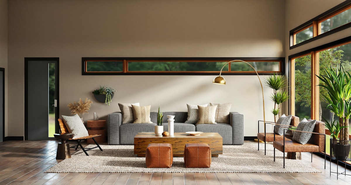
Colour is the fastest, most affordable way to transform a home, yet choosing shades from a fan deck of hundreds can feel overwhelming. The best paint colours for home interiors are not just about trends; they depend on the room's function, natural light, size and the mood you want to create. This 2026 guide shares room-wise palettes, colour psychology and tried-and-tested combinations for Indian homes, along with a handy sheen and finish reference to help you commit with confidence.
How to Choose Interior Colours
Start with the room's purpose and the amount of natural light it receives. North-facing and low-light rooms benefit from warm, light shades that add cosiness, while bright, sunny rooms can carry cooler or deeper tones. Always consider your flooring, furniture and curtains as part of the palette.
A reliable approach is the 60-30-10 rule: 60% a dominant neutral, 30% a secondary colour, and 10% an accent. This keeps schemes balanced and prevents any one colour from overwhelming the space.
Colour Psychology Basics
Colours influence mood, which is why bedrooms and living rooms call for different palettes. Understanding the basics helps you pick shades that support how each room is used.
- Blues and greens: calming, restful, ideal for bedrooms
- Yellows and oranges: warm, energetic, great for dining and kitchens
- Neutrals (beige, greige, off-white): timeless, versatile backdrops
- Deep tones (charcoal, teal): dramatic accents for feature walls
Living Room Colour Palettes
The living room is where you welcome guests, so it should feel warm and inviting. Soft neutrals like ivory, greige and warm white make a versatile base that suits any furniture. Add character with an accent wall in terracotta, sage green or a muted blue.
For a 2026 look, earthy and nature-inspired tones are trending, think olive, ochre and warm taupe, paired with wood and rattan textures. Keep ceilings light to maintain a sense of height.
Paint the mood, not the trend. A colour that feels calm and right to you every evening will always outlast whatever is fashionable this year.
Bedroom Paint Colours
Bedrooms should promote rest, so lean towards soothing, muted shades. Soft blues, sage greens, dusty pinks, lavender and warm greys all encourage relaxation. Avoid overly bright or stimulating colours in the sleeping zone.
For the master bedroom, a muted teal or deep blue accent wall behind the bed adds depth without disturbing calm. Kids' rooms can be more playful, but keep at least one wall neutral so the scheme grows with the child.
Kitchen and Dining Colours
Warm, appetite-friendly colours suit dining spaces, soft yellows, terracotta, warm cream and gentle reds stimulate conversation and appetite. In kitchens, light and easy-to-clean shades work best on walls, letting the cabinet colour take the lead.
Whites, light greys and pastels keep kitchens feeling clean and spacious, while a single warm accent, perhaps a mustard or olive backsplash zone, adds personality.
Accent Walls and Combinations
An accent wall adds drama without committing the whole room to a bold colour. Choose the wall that naturally draws the eye, behind the bed, the sofa or the TV unit. Pair it thoughtfully with the base colour for a cohesive look.
| Room | Base Colour | Accent Colour | Mood |
|---|---|---|---|
| Living Room | Warm greige | Terracotta / Sage | Cosy, welcoming |
| Master Bedroom | Soft grey | Muted teal | Calm, restful |
| Kids Room | Off-white | Cheerful yellow / blue | Playful |
| Dining Area | Warm cream | Ochre / Rust | Inviting |
| Home Office | Light greige | Deep green | Focused |
Finishes and Sheen Levels
The paint finish is as important as the colour. Sheen affects durability, washability and how light bounces off the wall, so match it to the room.
- Matte / flat: hides imperfections, elegant, best for bedrooms and ceilings
- Eggshell / soft sheen: subtle glow, wipeable, great for living rooms
- Satin: more durable and washable, good for kids' rooms and hallways
- Semi-gloss / gloss: highly washable, for kitchens, trims and doors
Leading brands like Asian Paints, Berger, Dulux and Nerolac offer washable premium emulsions such as Royale and Weathercoat ranges, worth the extra cost in high-traffic Indian homes with kids.
Testing Colours Before You Commit
Never finalise a colour from a small chip. Buy sample pots, paint a 2 x 2 foot patch on the actual wall, and observe it across morning, afternoon and evening light. Colours shift dramatically between daylight and warm indoor lighting.
Also check the shade against your flooring and furniture in the room itself. A little patience here saves the cost and hassle of repainting. For a professional colour scheme tailored to your home's light, layout and style, our designers can create a full palette and 3D preview. To get started, book a free consultation with Panache Architect.